As a class project, my group and I were tasked to design an interface for users who wanted to purchase shampoo and conditioner through a machine that is very similar to the Coca-cola dispensers in major fast food chains.
Initial sketches and Drafts
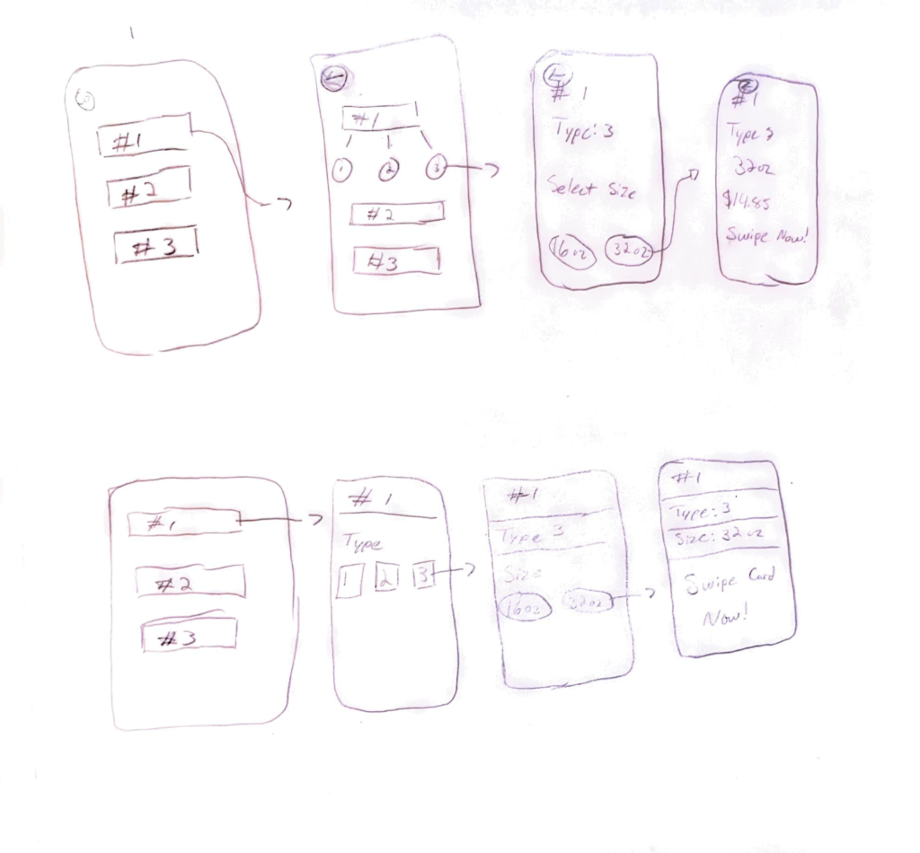
We started with various designs that we believed would help solve the issue while also providing a positive user experience. We experimented with a square or blocky interface initially but eventually deviated from that as we wanted the user expectations of kiosks behaving more fluidly. Much like the Coca-cola dispensers.
Initial Design and Research
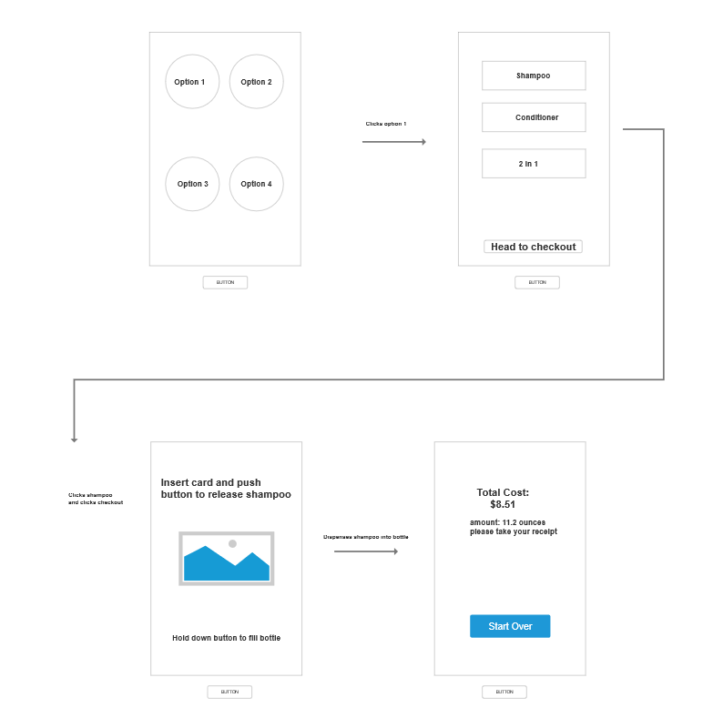
Once we settled on a style for the interface, we created a wire-frame to ensure the order of how users would purchase their orders to avoid confusion and establish a constant pattern we design for. Once we created the wire-frame, we started creating assets for the final prototype in Axure.
And to better understand the assignment, we also spent additional time interacting with the Coca-cola soda dispensers to see how users interact with kiosks as well as how they expect them to behave and react.
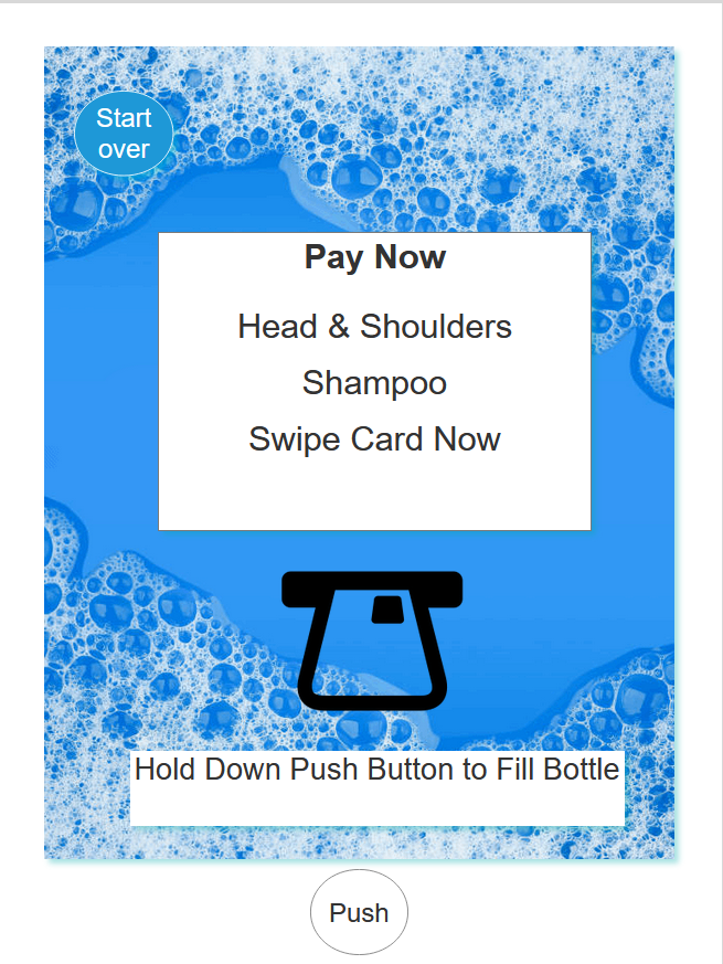
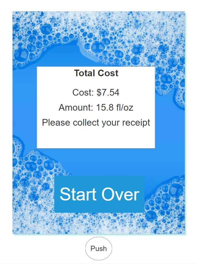
Final Prototype
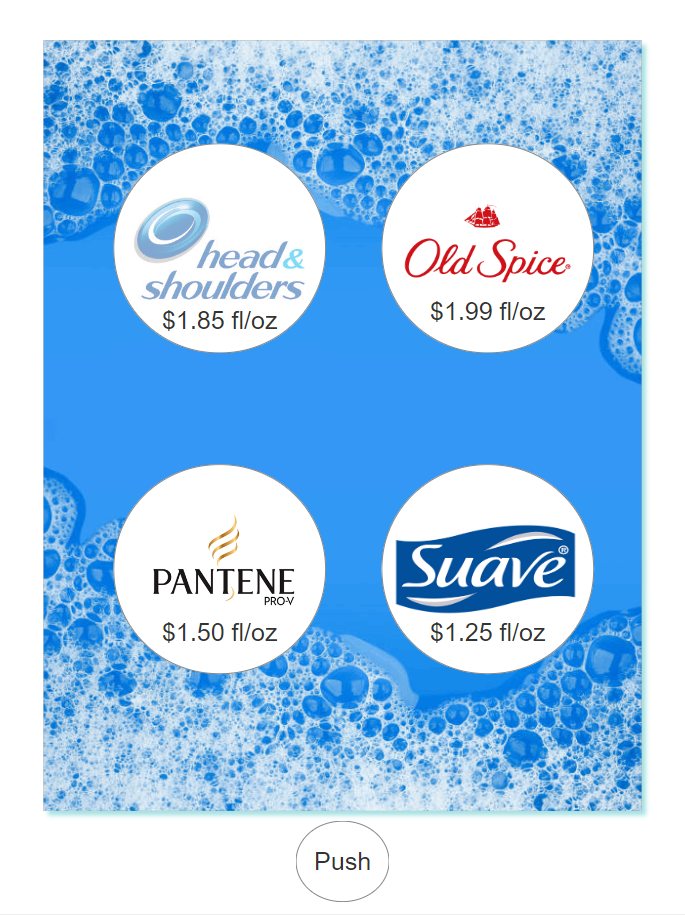
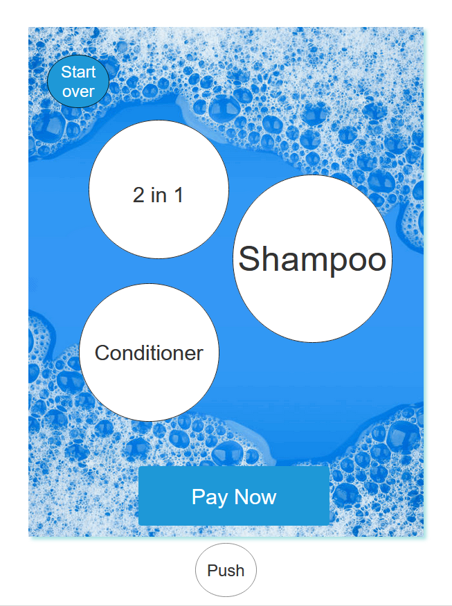
Using Axure, we created an interactive prototype using circular icons instead of squares and created an appropriate background to establish the function and utility of the kiosk.
What I learned
The soap Dispenser offered unique challenges for me. Initially, the group designed the screens to involve a wheel style picker where you have to drag a menu up or down to select from a list. But we realized that these kiosk screens are usually very thick, making it difficult for the screen to register that kind of movement. So we continued with the single tap navigation. Once the screens were made, we also spent time creating the assets that would be used for the prototype. We created a background image as well as brand logo assets.